Mark Twain didn’t actually say “I would have written a shorter letter, but I did not have the time.” (It was Blaise Pascal.)
But the point holds. Writing short and tight takes time.
Which might explain why the news web site I used to run has 485 links today on its home page. It’s just easier to include everything and let the reader sort it all out.
But what would a news site look like if editors actually, you know, edited.
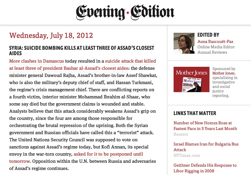
 One answer arrived this week. This was not a Knight News Challenge winner or the result of months of research and development. It’s a quick side-project from Mule Design, and it’s called Evening Edition.
This is what the news world could look like If simplicity-appreciating geeks ran it.
Jon Mitchell of Read Write Web has the back-story, in his article These Designers Did for Fun What News Sites Can’t Do to Save Their Business:
It’s edited by Anna Rascouët-Paz, online media editor at Annual Reviews. She combs the day’s political and economic news from around the world, picks out the stories she finds important, and writes a paragraph explaining the significance of each story, including links to the reporting.
“It’s not aggregation,” (the agency’s design director Mike) Monteiro makes clear. She often combines several sources into a concise summary. It draws on other people’s reporting, like just about all of what passes as news these days – but Evening Edition performs a critical journalistic function that often falls by the wayside online: It elevates the significant information above the noise.
Oh and this: They took it from concept to live site in about a week.
I’m making a conscious choice here. I’m going to celebrate what’s right with Evening Edition, rather than focus on what feels wrong (most notably that it wears its once-a-day-with-no-updates ethos with a pride that’s weird in a medium that is built upon being live and linked).
There’s a lot to like.
What’s right: It’s edited. Like it or not, Evening Edition is the result of choices by a human editor. What you get is there because she decided that’s what you get. Great Ceasar’s Ghost!
What’s right: It’s clean. Look at this on your laptop and you’ll see a simple two-column layout. Open it on your phone, and the responsive single-column design is there in all its scroll-friendly glory.
What’s right: It’s just enough news. Assuming the editor does her job well, this could very well be all you need to read to feel as if you’re reasonably well caught-up on the day’s important stories.
What’s right: It exists. This isn’t a scribble in a notebook, it’s not a mind-map and it most assuredly is not a committee meeting that’s scheduled for every other Thursday. This is a swing at an answer to the question of how to present news to a busy modern reader. It may not be the perfect answer but, as the bold-face says, it exists, here and now.
What do you think? Is just-enough news a concept whose time has come?


 Jon Mitchell says
July 19, 2012 at 2:07 pmGreat post, Tim. I can feel the restraint in your voice, though. I’d really like to hear more about the part that feels wrong to you. That’s my favorite part of the service.
 Tim Windsor says
July 19, 2012 at 2:28 pmWhat doesn’t feel quite right to me is that it’s an artificial constraint. Some days, yes, this is perfect. Others, I might miss the live element. As one commenter put it on your original article, it’s a bit nostalgic.
Also, it’s too “general news” for my taste, but that’s in no way a knock against the concept or the execution. Just maybe not the mix I’d find myself craving every single day.
So, yes, restraint. I was consciously resisting A Catalogue of All of the Things They Got Horribly Wrong, and wrote this instead to celebrate the fact that Evening Edition exists at all.
 Jim Ray says
July 19, 2012 at 3:27 pmTim, great post, and thanks for the writeup. The “artificial constraint” of EE is definitely by design, in much the same vein of Twitter’s 140 characters. We think we’ll figure out what the “right” balance is as we move forward, we’d love to hear more about what could be improved.