A colleague sent me a link to Middlebury College’s web site recently, and I was really impressed.
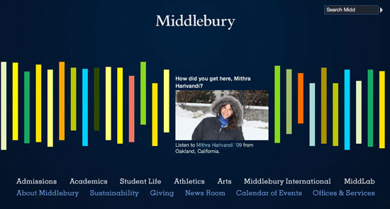
It’s very simple – just a name, a search box, some navigation and a horizontally-scrolling series of colored bars:
But hidden inside those colored bars is a candbox-like invitation to sample stories about the institution that’s kind of irresistible. The folks at Middlebury answered the same question we all do — “How do we show the breadth of ours schools and universities in a limited space?” — in an innovative fashion. Yes, as Jakob Nielsen would say, it’s Mystery Meat, but in this case, the mystery is compelling enough to be part of the charm.
It’s not perfect — I wish whoever is preparing the photos and screengrabs would take more care that they not lose their vitality in the downsizing — but overall, it’s a site feature that works hard to tell the story of Middlebury. And that’s really all we can ask of our sites.


