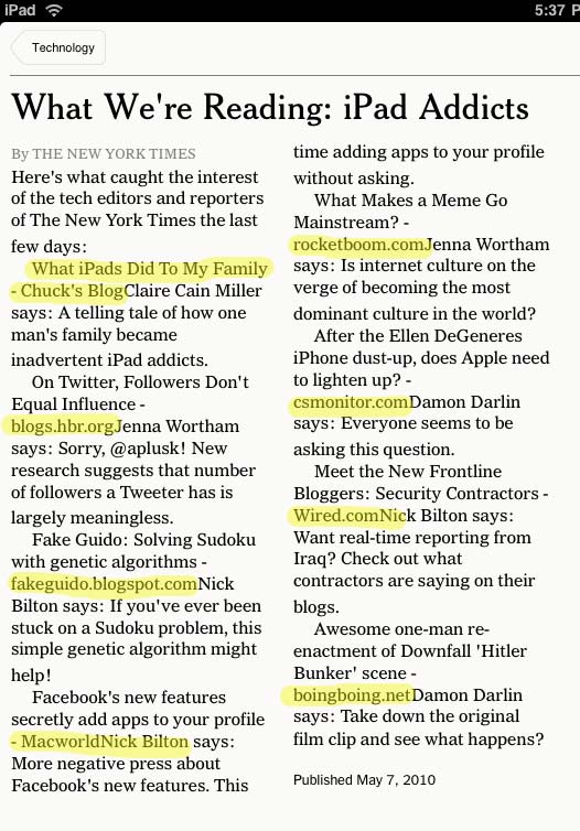
 At first, I tried to enjoy its simplicity, but the NYT “Editor’s Choice” app is starting to get really ridiculous. Witness this article that’s nothing more than a collection of links that — are you ready for it? — don’t link.
(Failure highlighted in yellow for your reading pleasure.)
The only explanation: the focus group was infiltrated by radical newsroom curmudgeons.
No wonder Steve hates it.
(UPDATE: Apparently this particular “Editor’s Choice” is just shovelware, badly done. The original page makes a whole lot more sense with the links intact.)


 Towing New York says
May 10, 2010 at 7:12 pmpretty funny.
I think that NYT are still in a learning curve regarding how to give a good UX on the IPAD, it’s not quite there yet.