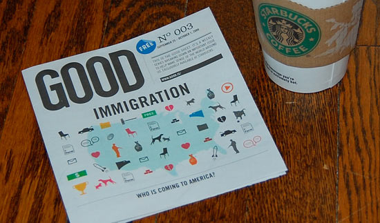
At my local Starbucks this morning, I noticed this:
It’s one sheet of newsprint, folded to about six-inches square, focused on one topic, published once a week, distributed free.
To a non-print reading public, this may be the perfect newspaper.
To be fair, this is probably not where our local papers are headed, but it is a step in the right direction. After all, what’s the number-one reason people give for canceling a newspaper subscription? Not enough time to read. A typical metro daily has hundreds of entry points and dozens of topics.
The Good Sheet has one topic and dozens of entry points, presented as a quick primer on key issues for the upcoming U.S. election. It’s hardly a purely objective vehicle, but the issue I picked up – on immigration – attempted to focus more on facts than cant.
But what interests me more than the content is the form. Designed to be a quick-read for when you’re waiting for your latte or as a conversation-starter for the table-hogs, The Good Sheet makes it incredibly easy to dive into a single topic. Imagine if a local news organization – paper, tv station, talk radio program – took a similar approach to offer hooks into issues of local interest.
There’s decent web presence for the Good Sheet as well (mercifully free of the assault of headlines you’ll find on most news sites), though I don’t like how the only response to clicking the “discuss” link is a message that says “You need to be logged in in order to do that.” Also, the paper could benefit from suggested links/sources for further reading, but all-in-all, I think this is a worthy print experiment.
And, it’s sponsored, by Starbucks, of course, which underwrites the distribution, but also by Lenovo, which has a full-page ad that, smartly, picks up the theme of education and empowerment. So, as Navin Johnson would say, it’s a profit deal.
Any other examples of micro-editing in the print world?


